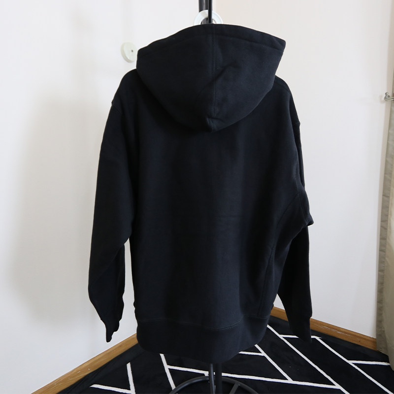
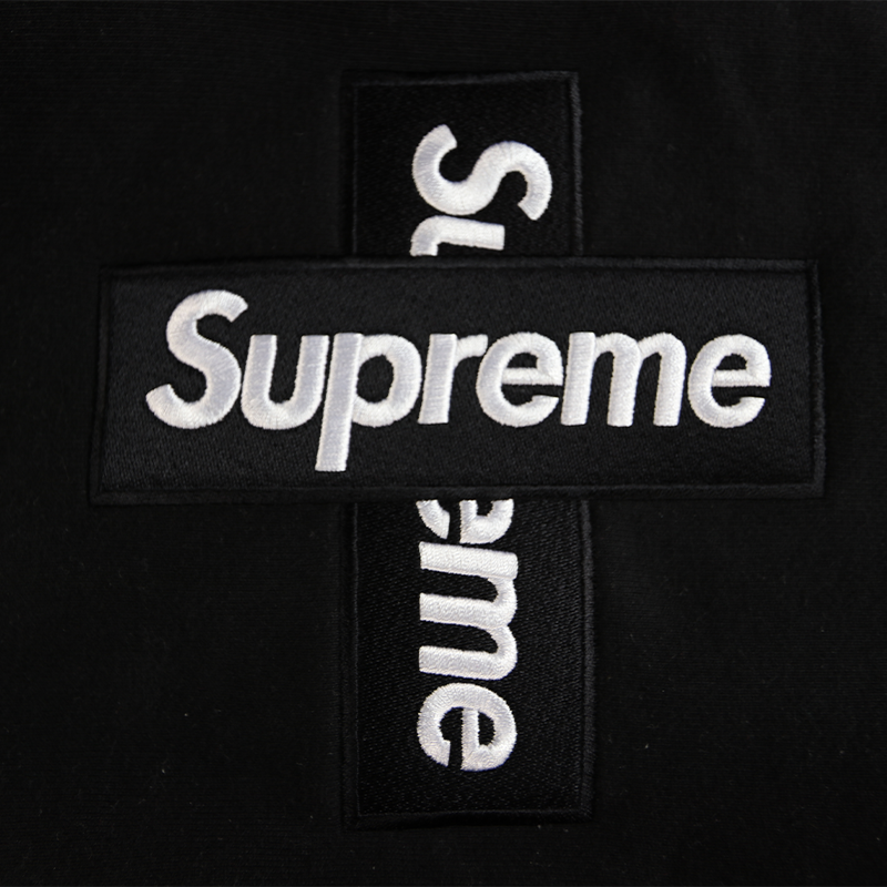
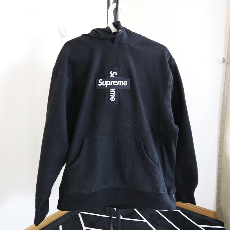
Supreme cross box logo hoodie by Teenage club
Teenage Club’s Supreme items are always closest to the retail, and in this review, we will point out the Supreme cross box logo hoodie flaws. We could not gather enough photos of the hoodie; therefore, this review will only point out the common flaws. The images used in this review came from a Reddit user “Mohindrx”.
YouTube review
In-hand pictures
Flaw 1


The embroidery of the “Supreme” word on both hoodies is slightly different; the authentic letter has an embroidery effect, whereas the Teenage Club’s embroidery has a more subtle texture. The letter spacing on the Teenage Club’s hoodie is a tad off the authentic ones.
Flaw 2


Looking at the overall cross box logo on both hoodies, the Teenage Club’s cross bog logo is straight, whereas the authentic cross box logo is arched and gives it a bulky look. This flaw is considered subtle but could be noticeable in close proximity.
Flaw 3


There is a difference in the neck tag stitching when comparing both hoodies. If zoomed in on the neck tag, the Teenage club’s texts on the neck tag appear to be thicker than the authentic ones. Furthermore, the texts on the authentic ones seem to be pixelated but not on the Teenage club’s neck tag.
Flaw 4


A few differences exist in comparing the wash label on both Supreme Cross Box Logo hoodies. Teenage Club’s wash label font is thicker than the retail. Furthermore, the letter “Y” print is faded, and the font size is inconsistent. The copyright symbol on Teenage Club’s wash label is thicker than the original.
There are loose threads everywhere on Teenage Club stitching, but it’s a simple fix: cutting off the loose threads.
Flaw 5


Shifting your focus to the Supreme cross box logo, compare the letter “e” on both hoodies. The teenage club letter “e” tail is shorter and incomplete compared to the authentic ones.
Flaw 6


The Supreme text differs on both arm labels. The Teenage Club’s Supreme text is wonky compared to the original. Moreover, the Teenage Club font is thinner than the original font.
Flaw 7


Flipping underneath the Supreme Cross box logo to compare the differences between Teenage Club and the original. The Teenage Club has too many loose threads, and the texture of the embroidery differs from the retail.
Flaw 8


The letter “R” on the original is a tad bigger than the Teenage Club, especially the bottom part of the letter. The spacing between the neck tags is wider on the Teenage Club hoodie but narrower on the original hoodie.
Conclusion
Overall, those flaws mentioned are minor, and it would be hard to authentic in public. The hoodie is comfortable and thick enough to keep warm. We believe that Teenage Club Supreme hoodies are the closest to retail and sell at a reasonable price. As always, peace out and stay vibey.


