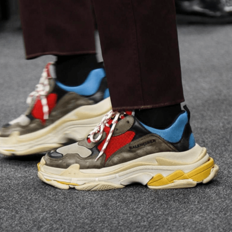
Balenciaga Triple S by Bean Studio
Bean’s Balenciaga Triple S has been one of the most popular purchases and has been reviewed by many Reddit users. We will point out its flaws in this review.
Flaw 1


Let’s compare the difference in the embroidery on the side of the sneaker. The font on Bean’s sneaker is bold compared to the authentic ones. The most apparent letters are “B”, “N” and “G” in “Balenciaga”.
Flaw 2


Flip to the back of the sneaker and compare the heel text. The letter “G” in “Balenciaga” on Bean’s sneaker seems like a serif font and not a sans-serif font, while the rest of the text is sans-serif even on the authentic ones. The word on Bean’s sneaker is embossed more profound than the authentic ones just by looking at the letter “A”.
Flaw 3


The text printed on the insole is very similar; however, looking at letter “G” in “Balenciaga” on Bean’s insole, the font is bolder than the authentic ones.
Flaw 4


The size tags on both sneakers are vastly different. Starting with the Stichting on Bean’s tag, which is crooked, and the cut out of the size tag is curved. On the other hand, the authentic stitching is uniform, and the cut-out of the tag is more squarish than Bean’s tag. The font is very similar on both tags!
Flaw 5


The “BALENCIAGA” word on the sole of the Balenciaga Triple S on both sneakers is slightly different. Bean’s sneaker seems to miss the letters’ arching, which is profound to the naked eye. The letters “A” and “N” in “BALENCIAGA” on Bean’s sneaker would be the most obvious in the missing arch.
Conclusion
Overall, Bean’s Balenciaga Triple S is similar to the retail with minor flaws. Wearing the sneaker in public will be hard to authenticate, and you will get lots of compliments. Rep Preview Studio will purchase a pair from Bean to do an in-depth YouTube review. As always, peace out and stay vibey.


